11 Correlation and regression
11.1 Introduction
Most empirical research is focused on establishing associations between variables. In experimental research, this primarily concerns associations between independent and dependent variables. In the coming section, we will look in more detail at the distinct ways of establishing whether a “significant” (meaningful, non-accidental) relation exists between the independent and dependent variables. In addition, the researcher might be interested in the associations between several dependent variables, for example the associations between the judgements of several raters or judges (see also Chapter 12).
In quasi-experimental research, the difference between independent and dependent variables is usually less clear. Several variables are observed and the researcher is particularly interested in the associations between the observed variables. What, for instance, is the association between the scores for reading, arithmetic, and geography in the CITO study (see Table 9.1)? In this chapter, we will look in more detail into the ways of expressing the association in a number: a correlation coefficient. There are different correlation coefficients depending on the variable’s levels of measurement, which we will examine more in this chapter.
It is advisable to always first make a graphic representation of an association between the variables, in the form of a so-called scatter plot, like in Figure 11.1. Each point in this scatter plot corresponds with a pupil (or more generally, with a unit from a sample). The position of each point (pupil) is determined by the observed values of two variables (here \(X\) is the score for the reading test, \(Y\) is the score for the arithmetic test). A scatter plot like this helps us to interpret a potential correlation, and to inspect whether the observations indeed satisfy the preconditions for calculating a correlation from the observations. In any case, look at (a) the presence of a potential correlation, (b) the form of that correlation (linear, exponential,…), (c) potential outliers (extreme observations, see §9.4.2), and (d) the distribution of the two variables, see §9.7.
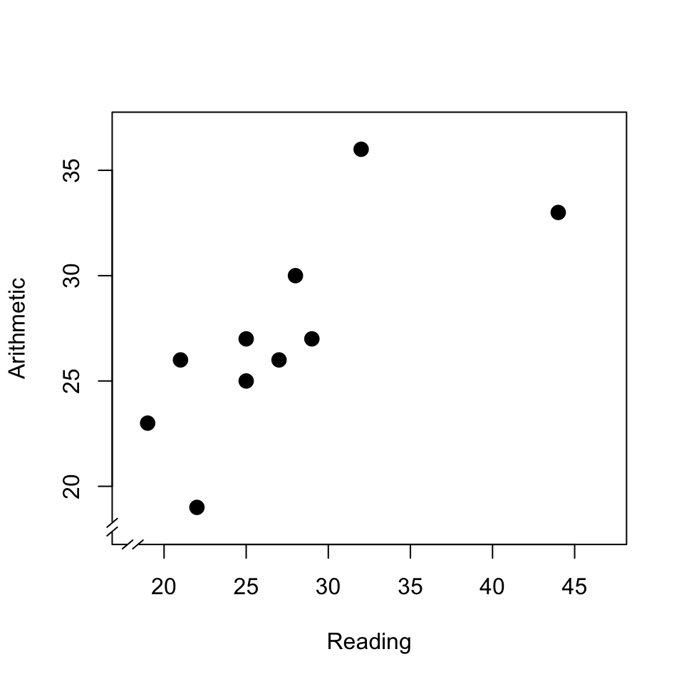
Figure 11.1: Scatter plot of the scores of a reading test and an arithmetic test; see text.
This scatter plot shows (a) that there is a relation between the scores for reading and arithmetic. The relation is (b) approximately linear, i.e. can be described as a straight line; we will return to this in §11.3. The relation also helps us to explain the dispersion in the two variables. After all, the dispersion in the arithmetic scores can be partially understood or explained from the dispersion in the reading test: pupils who achieve a relatively good score in reading, also achieve this in arithmetic. The observations from the two variables thus not only provide information about the two variables themselves, but moreover about the association between the variables. In this scatter plot, we can moreover see (c) that the highest reading score is an outlier (see also Chapter 9, Figure 9.3); such outliers can have a disproportionately large influence on the correlation found.
11.2 Pearson product-moment correlation
The Pearson product-moment correlation coefficient is referred to with the symbol \(r\) (in the case of two variables). This coefficient can be used if both variables are observed on the interval level of measurement (§4.4), and if both variables are approximately normally distributed (§10.3). Nowadays, we do this calculation by computer.
For the observations in the scatter plot in Fig.11.1, we can find a correlation of \(r=+.79\). The correlation coefficient is a number that is by definition between \(-1\) and \(+1\). A positive correlation coefficient indicates a positive relation: a larger value of \(X\) corresponds with a larger value of \(Y\). A negative correlation indicates a negative relation: a larger value of \(X\) corresponds with a smaller value of \(Y\). A value of \(r\) which is close to zero indicates a weak or absent correlation: the dispersion in \(X\) is not related to the dispersion in \(Y\); there is no or only a weak correlation. We call a correlation of \(.4<r<.6\) (or \(-.6 < r < -.4\)) moderate. A correlation of \(r>.6\) (or \(r< -.6\)) indicates a strong association. If \(r=1\) (or \(r=-1\)), then all observations are precisely on a straight line. Figure 11.2 shows several scatter plots with the accompanying correlation coefficients.
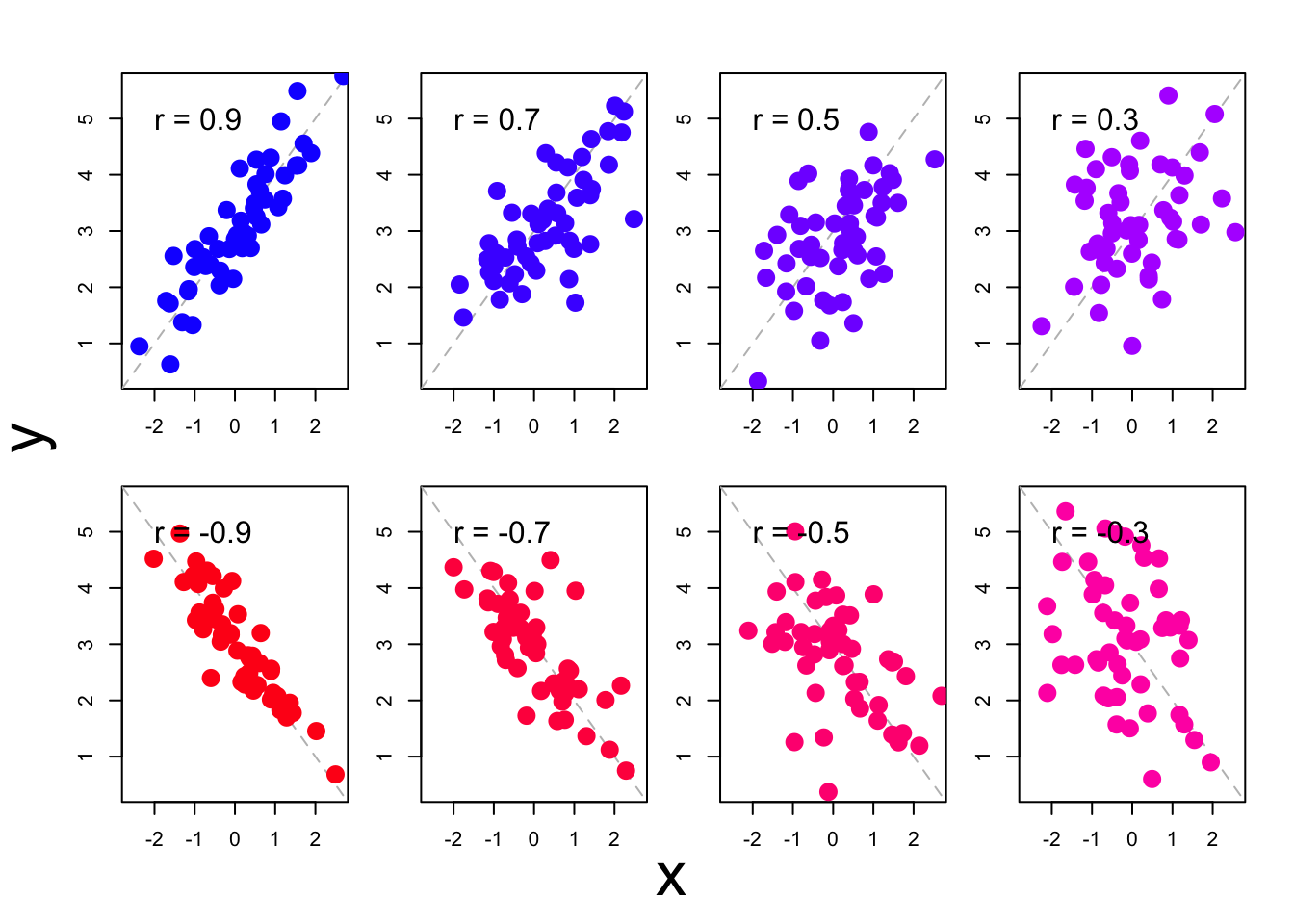
Figure 11.2: Some scatter plots of observations with accompanying correlation coefficients.
The correlation we see between the scores of the two variables (like \(r=.79\) between scores for the reading test and arithmetic test, Fig.11.1) might also be the result of chance variations in the observations. After all, it is possible that the pupils who have a good score on the reading test achieve a good score on the arithmetic test purely by chance — also when there is actually not a correlation between the two variables in the population. We refer to the unknown correlation in the population with the Greek letter \(\rho\) (“rho”); as such, it is also possible that \(\rho=0\). Even if \(\rho=0\), it is possible to have \(n=10\) pupils in the sample who by chance combine high scores on one part with high scores on the other part (and by chance not have pupils in the sample who combine high scores on one part with low scores on the other part). We can estimate what the probability \(p\) is of finding this correlation of \(r=0.79\) or stronger in a sample of \(n=10\) students, if the association in the population is actually nil (i.e. if \(\rho=0\)). We call this probability \(p\) the significance of the correlation coefficient; in Chapter 13, we will look in more detail at this term ‘significance’. In anticipation of this: if this probability \(p\) is smaller than \(.05\), then we assume that the correlation found \(r\) is not by chance, i.e. is significant. We often see a small probability \(p\) with a strong correlation \(r\). The correlation coefficient \(r\) indicates the direction and strength of the relation, and the significance \(p\) indicates the probability of finding this relation by chance if \(\rho=0\) in the population. We report these findings as follows25:
Example 11.1: The scores of the \(n=10\) pupils on the CITO test subparts in Table 9.1 show a strong correlation between the scores on the Reading and Arithmetic tests: Pearson \(r=.79, p=.007\). Pupils with a relatively high score on one test generally also achieve a relatively high score on the other test.
In many studies, we are interested in the correlations between more than two variables. These correlations between variables are often reported in a so-called pairwise correlation matrix like Table 11.1, which is a table where the correlations of all pairs of correlations are reported.
| Reading | Arithmetic | Geography | |
|---|---|---|---|
| Reading | 1.00 | ||
| Arithmetic | .79 (.007) | 1.00 | |
| Geography | -.51 (.13) - | .01 (.97) | 1.00 |
In this matrix, only the lowest (left) half of the complete matrix is shown. This suffices because the cells are mirrored along the diagonal: after all, the correlation between Reading (column 1) and Arithmetic (row 2) is the same as the correlation between Arithmetic (row 2) and Reading (row 1). In the cells on the diagonal, the pairwise correlation matrix always contains the value \(1.00\), since a variable always correlates perfectly with itself. We report these findings as follows:
Example 11.2: The pairwise correlations between scores from the \(n=10\) pupils on the three subparts of the CITO test are summarised in Table 11.1. We can see a strong correlation between the scores for the Reading and Arithmetic tests: pupils with a relatively high score on the Reading test generally also achieve a relatively high score on the Arithmetic test. The remaining correlations were not significant.
11.2.1 Formulas
The simplest formula for the Pearson product-moment correlation coefficient \(r\) makes use of the standard normal scores we already used earlier (§9.8): \[\begin{equation} r_{XY} = \frac{\sum z_X z_Y}{n-1} \tag{11.1} \end{equation}\]
Just like when we calculate variance (formula (9.3)), we divide again by \((n-1)\) to make an estimate of the association in the population.
11.2.2 SPSS
For Pearson’s product-moment correlation coefficient:
Analyze > Correlate > Bivariate...Choose Pearsons correlation coefficient, tick:
Flag significant correlations. Confirm OK. The resulting
output (table) does not satisfy the style requirements; as such, you should
take the data into or convert it into a table of your own which does satisfy these requirements.
11.2.3 JASP
For Pearson’s product-moment correlation coefficient, go to the top menu bar and choose:
Regression > Classical: CorrelationIn the field “Variables”, select the variables of which you want to know the correlation.
Make sure that under “Sample Correlation Coefficient”, option Pearson's r is checked.
Under “Additional Options”, check Report significance, Flag significant correlations and Sample size. You may also check the option Display pairwise to obtain simple table output.
Note that with or without this option checked, the output table does not adhere to APA guidelines for reporting such tables; hence you’ll need to revise the table or create your own using the JASP output.
11.2.4 R
cito <- read.table(file="data/cito.txt", header=TRUE)
# variable names are Lezen=Reading, Rekenen=Arithmetic, WO=Geography, ...
dimnames(cito)[[2]] <- c( "Pupil", "Reading", "Arithmetic", "Geography",
                          "UrbanRural", "Arith.2cat" )
cor( cito[,2:4] ) # correlation matrix of columns 2,3,4
## Reading Arithmetic Geography
## Reading 1.0000000 0.74921033 -0.50881738
## Arithmetic 0.7492103 1.00000000 0.06351024
## Geography -0.5088174 0.06351024 1.00000000##
## Pearson's product-moment correlation
##
## data: Reading and Arithmetic
## t = 3.1994, df = 8, p-value = 0.01262
## alternative hypothesis: true correlation is not equal to 0
## 95 percent confidence interval:
## 0.2263659 0.9368863
## sample estimates:
## cor
## 0.749210311.3 Regression
The simplest relation that we can distinguish and describe is a linear
relation, i.e. a straight line in the scatter plot
(see Fig.11.2). This straight line indicates which value
of \(Y_i\) is predicted, on the basis of the value of \(X_i\). This predicted value of
\(Y_i\) is noted as \(\widehat{Y_i}\)
(“Y-hat”). The best prediction \(\widehat{Y_i}\) is based on both the value
of \(X_i\) and the linear relation between \(X\) and \(Y\):
\[\begin{equation}
\widehat{Y_i} = a + b {X_i}
\tag{11.2}
\end{equation}\]
The straight line is described with
two parameters, namely the intercept (or constant) \(a\) and the slope \(b\)
26. The straight line which describes the linear relation is often
referred to as the “regression line”;
after all, we try to trace the observed values of \(Y\) back to this linear
function of the values of \(X\).
The difference between the observed value \(Y\) and the predicted value \(\widehat{Y}\) \((Y-\widehat{Y})\) is called the residual (symbol \(e\)). In other words, the observed value is considered to be the sum of two components, namely the predicted value and the residual: \[\begin{align} Y &= \widehat{Y} + e \\ &= a + b X + e \tag{11.3} \end{align}\]
The above rationale is illustrated in the scatter plot in Figure 11.3. The dashed line indicates the linear relation between the two tests: \[\begin{equation} \widehat{\textrm{Arithmetic}} = 12.97 + 0.52 \times \textrm{Reading} \tag{11.4} \end{equation}\]
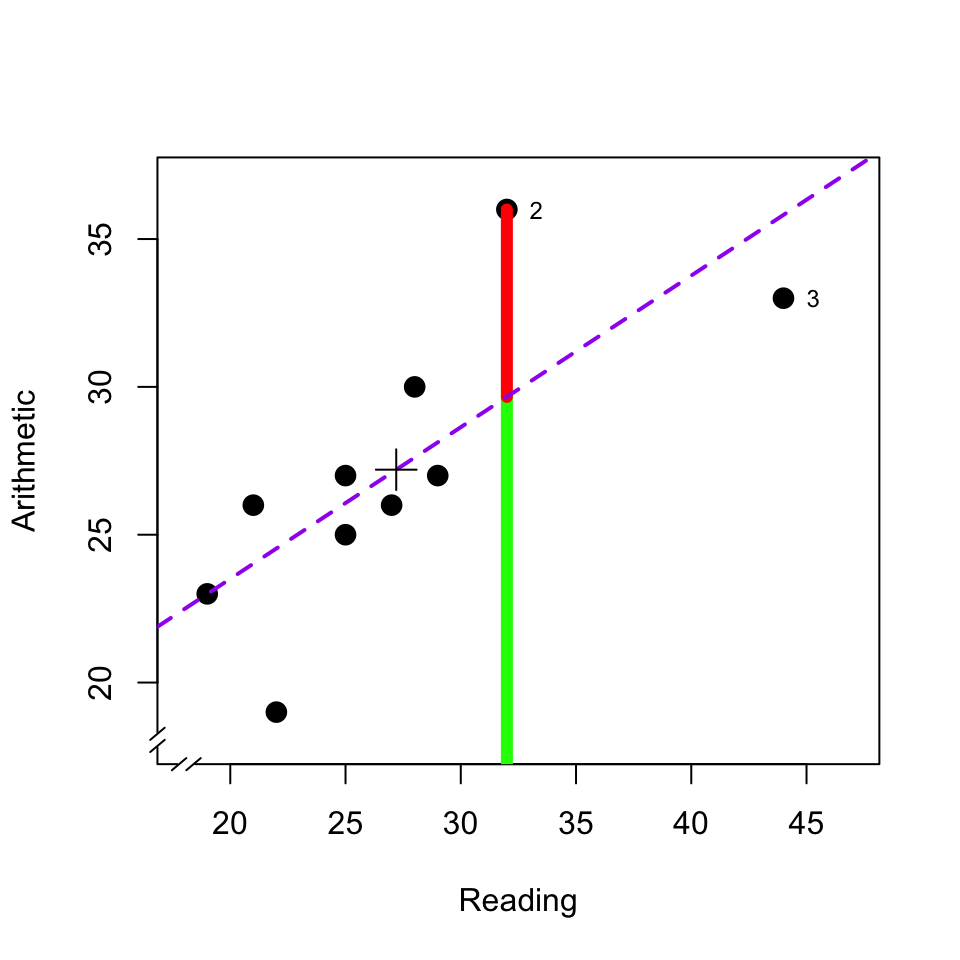
Figure 11.3: Scatter plot of the scores of a reading test and an arithmetic test. The diagram also indicates the regression line (dashed line), the predicted value (green) and residual (red) of the arithmetic test for pupil 2, the average (plus symbol), and markings for pupil 2 and 3; see text.
This dashed line thus indicates what the value \(\widehat{Y}\) is for each value of \(X\). For the second pupil with \(X_2 = 32\), we thus predict \(\widehat{Y_2} = 12.97 + (0.52) (32) = 29.61\) (predicted value, green line fragment). For all observations which are not precisely on the regression line (dashed line), there is a deviation between the predicted score \(\widehat{Y}\) and the observed score \(Y\) (residual, red line fragment). For the second pupil, this deviation is \(e_2 = (Y_2 - \widehat{Y_2}) = (36-29.61) = 6.49\) (residual, red line fragment).
As stated, the observed values of \(Y\) are considered to be the sum of two components, the predicted value \(\widehat{Y}\) (green) and the residual \(e\) (red). In the same way, the total variance of \(Y\) can be considered to be the sum of the two variances of these components: \[\begin{equation} s^2_{Y} = s^2_{\widehat{Y}} + s^2_e \tag{11.5} \end{equation}\] Of the total variance \(s^2_Y\) of Y, one part (\(s^2_{\widehat{Y}}\)) can be traced back to and/or explained from the variance of \(X\), via the linear relation described with parameters \(a\) and \(b\) (see formula (11.2)), and the other part (\(s^2_e\)) cannot be retraced or explained. The second part, the non-predicted variance of the residuals is also called the residual variance or unexplained variance.
When we are able to make a good prediction \(Y\) from \(X\), i.e. when the Pearson product-moment correlation coefficient \(r\) is high (Fig. 11.2, left), then the residuals \(e\) are thus relatively small, the observations are close around the regression line in the scatter plot, and then the residual variance \(s^2_e\) is also relatively small. Conversely, when we are not able to predict \(Y\) well from \(X\), i.e. when the correlation coefficient is relatively low (Fig. 11.2, right), then the residuals \(e\) are thus relatively large, the observations are widely dispersed around the regression line in the scatter plot, and then the residual variance \(s^2_e\) is thus also relatively large. The square of the Pearson product-moment correlation coefficient \(r\) indicates what the relative size of the two variance components is, with respect to the total variance: \[\begin{align} r^2 & = \frac{s^2_{\widehat{Y}}}{s^2_Y} \\ & = 1 - \frac{s^2_e}{s^2_Y} \tag{11.6} \end{align}\] This statistic \(r^2\) is referred to as the “proportion of explained variance” or as the “coefficient of determination”.
The values of the linear parameters \(a\) and \(b\) in formula (11.2) are so chosen that the collective residuals are as small as possible, i.e. that the residual variance \(s^2_e\) is as small as possible (“least squares fit”), and thus \(r^2\) is as large as possible (see §11.3.1). In this way, we can find a straight line which best fits the observations for \(X\) and \(Y\).
A linear regression can also be reported as follows:
Example 11.3: Based on a linear regression analysis, it appears that the score for Arithmetic is related to that for Reading: \(b=0.51, r=.79, p_r=.007\), over \(n=10\) pupils. This linear regression model explains \(r^2=.51\) of the total variance in the arithmetic scores (the residual standard deviation is \(s_e= \sqrt{82.803/(n-1-1)} = 3.22\)).
11.3.1 Formulas
For linear regression of \(y\) on \(x\), we try to estimate the coefficients \(a\) and \(b\) such that (the square of) the deviation between the predicted value \(\hat{y}\) and the observed value \(y\) is as small as possible, in other words that the square of the residuals \((y-\hat{y})\) is as small as possible. This is called the “least squares” method (see http://www.itl.nist.gov/div898/handbook/pmd/section4/pmd431.htm).
The best estimation for \(b\) is \[b = \frac{ \sum_{i=1}^n (x_i-\overline{x})(y_i-\overline{y}) } { \sum_{i=1}^n (x_i-\overline{x})^2 }\]
The best estimation for \(a\) is \[a = \overline{y} - b \overline{x}\]
11.3.2 SPSS
For linear regression:
Analyze > Regression > Linear...Choose Dependent variable: Arithmetic and choose
Independent variable: Reading. Under the button Statistics, tick
Model fit, tick R squared change, choose Estimates, and afterwards
Continue.
Under the button Plot, tick Histogram and tick also
Normal probability plot; these options are required to a get a
numerical (!) summary over the residuals.
(already check once)
Under the button Options, choose Include constant to also have
the constant coefficient \(a\) calculated. Confirm all choices with OK.
The resulting output includes several tables and figures; you cannot
transfer these directly into your report. The table titled Model
Summary contains the correlation coefficient, indicated here with capital
letter \(R=.75\).
The table titled Coefficients contains the regression coefficients. The
line which has the designation (Constant) states coefficient \(a=13.25\);
the line titled Reading states coefficient \(b=0.51\).
The table titled Residual Statistics provides information about both
the predicted values and the residuals. Check whether the mean of the residual
is indeed null. In this table, we can also see (line 2, column 4) that
the standard variation of the residuals is \(3.21\).
11.3.3 JASP
For linear regression, go to the top menu bar and choose:
Regression > Classical: Linear RegressionChoose the variable Arithmetic as “Dependent Variable”, and choose the variable Reading under “Covariates”.
Next, open the menu bar Model, and inspect whether the predictor Reading is indeed listed under “Model Terms”. The option Include intercept should be checked, in order to have the constant term or intercept a included in the regression model (see §11.3.1).
Open the menu bar Statistics, and check the options Estimates, Model fit and R squared change.
Under “Residuals”, check Statistics to obtain a numerical summary of the residuals.
Open the menu bar Plots, and choose plots for Residuals vs. histogram and Q-Q plot standardized residuals; these allow visual inspection of the (distribution of) residuals.
The resulting output contains several tables and figure, which do not conform to APA guidelines and hence cannot be used directly in your report (see also Example 11.3 above).
The table titled Model Summary reports the correlation coefficient, here reported with capital \(R=.75\).
The table titled Coefficients contains the regression coefficients. The row with indication (Intercept) reports the constant \(a=13.25\); the row with indication Reading reports the slope or regression coefficient \(b=0.51\).
The table titled Residual Statistics provides information about the predicted values and residuals. Inspect whether the mean of the residuals is approximately zero (it should be). We also see here (row 2, column 4) that the standard deviation of the residuals is \(3.21\).
11.3.4 R
##
## Call:
## lm(formula = Arithmetic ~ Reading, data = cito)
##
## Residuals:
##     Min      1Q  Median      3Q     Max
## -5.5332 -1.1167 -0.5332  1.7168  6.3384
##
## Coefficients:
##             Estimate Std. Error t value Pr(>|t|)
## (Intercept)  13.2507     4.4910   2.950   0.0184 *
## Reading       0.5128     0.1603   3.199   0.0126 *
## ---
## Signif. codes:  0 '***' 0.001 '**' 0.01 '*' 0.05 '.' 0.1 ' ' 1
##
## Residual standard error: 3.406 on 8 degrees of freedom
## Multiple R-squared:  0.5613, Adjusted R-squared:  0.5065
## F-statistic: 10.24 on 1 and 8 DF,  p-value: 0.01262
The command lm specifies a linear regression model, with Arithmetic
as the dependent variable and Reading as the predictor. This model is
saved as an object called m1, and that is used again directly as an argument
(input) for reporting. In the reporting of model m1 the constant coefficient
\(a\) is referred to as the Intercept.
## [1] 3.21153311.4 Influential observations
In the previous section, we saw that the aim in a correlation analysis or regression analysis is for a minimal residual variance. Earlier we also already saw that outliers or extreme observations, by definition, make a relatively large contribution to variance. Together, this means that outliers or extreme observations can have a large influence on the size of the correlation or on the regression found (the linear relation found). Pupil 3 has an extremely high score for Reading (see also Fig.9.3). If we discount pupil 3, then this would not greatly change the correlation (\(r_{-3}=.79\)) but it would change the slope of the regression line (\(b=0.84\), more than one and a half times as large as if pupil 3 were in fact included). This observation thus “pulls” hard on the regression line, precisely because this observation has an extreme value for \(X\) and therefore has much influence.
Non-extreme observations can, however, also have a large influence on the correlation and regression, if they are far away from the regression line and thus make a large contribution to the residual variance. This too can be seen in Fig.11.3. Pupil 2 has no extreme scores but does have the largest residual. If we discounted this pupil 2 then the correlation would be considerably higher (\(r_{-2}=.86\)) but the slope of the regression line would only change a little (\(b=0.45\)).
For a correlation analysis or regression analysis you always have to make and study a scatter plot, in order to see the pattern for yourself (is it linear?) and to inspect whether and to what extent the results may have been influenced by one or a few observation(s). Pay particular attention to observations which are far away from the mean, for each of the two variables, and to observations which are far away from the regression line.
11.5 Spearman’s rank correlation coefficient
The variables whose correlation we want to investigate are not always both expressed on the interval level of measurement (§4.4), regardless whether or not the researchers want to and are able to assume that both variables are approximately normally distributed (§10.3). In that case, the product-moment correlation is less suitable for quantifying the association. If the data is indeed expressed on an ordinal level of measurement, then we can use other correlation coefficients to express the association: Spearman’s rank correlation coefficient (\(r_s\)) and Kendall’s \(\tau\) (the Greek letter “tau”). Both of these coefficients are based on the ranking of the observations; we can thus always compute these correlations when we are able to order the observations. Nowadays, we also perform this calculation by computer. In this chapter, we only discuss the Spearman’s rank correlation coefficient.
The Spearman’s rank correlation coefficient is equal to the Pearson product-moment correlation coefficient applied to the ranks of the observations. We convert every observation from a variable to a rank number, from the smallest observed value (rank 1) to the largest observed value (rank \(n\)). If two or more observations have the same value, then they also receive the same (mean) rank. In Table 11.2, you can see the ranks of the scores for Reading and Arithmetic, ordered here according to the ranks for Reading.
| Pupil | 1 | 9 | 6 | 4 | 10 | 8 | 5 | 7 | 2 | 3 |
|---|---|---|---|---|---|---|---|---|---|---|
| Reading | 1 | 2 | 3 | 4.5 | 4.5 | 6 | 7 | 8 | 9 | 10 |
| Arithmetic | 2 | 4 | 1 | 4 | 6.5 | 4 | 8 | 6.5 | 10 | 9 |
| Difference \(v_i\) | -1 | -2 | 2 | 0.5 | -2 | 2 | -1 | 1.5 | -1 | 1 |
The ranking in Table 11.2 makes it clear at a glance that the three pupils with the lowest score for Reading (nos. 1, 9, 6) also almost achieved the lowest scores for Arithmetic. That indicates a positive relation. The two best readers (nos. 2 and 3) are also the two best arithmeticians. That also indicates a positive relation. However, there is also no question of a perfect positive relation (thus here \(r_s<1\)), because then the two rankings would match perfectly.
Think how Table 11.2 would look if there were a perfect negative relation (\(r_s=-1\)) between the scores for Reading and Arithmetic, and how the table would look if there were no correlation whatsoever (\(r_s=0\)) between these scores.
11.5.1 Formulas
The association between the rankings of the two variables is expressed in the Spearman’s rank correlation coefficient: \[\begin{equation} r_s = 1 - \frac{6 \sum v_i^2}{n(n^2-1)} \tag{11.7} \end{equation}\] in which \(v_i\) stands for the difference in rankings on both variables for respondent \(i\). The fraction in this formula gets larger and \(r_s\) thus gets smaller, the larger the differences between the ranks are. However, this formula can only be used if there are no “ties” (shared rankings) in the variables; for the dataset in Table 11.2 with “ties” in both variables we have to use another formula.
As can be seen, the Spearman’s rank correlation \(r_s\) is not equal to the Pearson product-moment correlation \(r\) for the scores observed. If the preconditions of the Pearson coefficient are satisfied, then this Pearson product-moment correlation coefficient provides a better estimation of the association than the Spearman’s rank correlation coefficient. However, if the preconditions are not satisfied, then the Spearman’s coefficient should be preferred again. The Spearman’s coefficient is, amongst others, less sensitive for influential extreme observations — after all, such outliers have less weighting once the raw scores have been replaced by the ranks.
11.5.2 SPSS
For Spearman’s rank correlation coefficient:
Analyze > Correlate > Bivariate...Choose Spearman rank correlation coefficient, tick:
Flag significant correlations. Confirm with OK. The resulting
output (table) does not satisfy the style requirements; you thus have to take
the data into or convert it into a table of your own which does satisfy these requirements,
and report according to the usual conventions for correlation analysis.
11.5.3 JASP
For Spearman’s rank correlation coefficient, go to the top menu bar and choose:
Regression > Classical: CorrelationIn the field “Variables”, select the variables of which you want to know the correlation.
Make sure that under “Sample Correlation Coefficient”, option Spearman's rho is checked.
Under “Additional Options”, check Report significance, Flag significant correlations and Sample size. You may also check the option Display pairwise to obtain simple table output.
Note that with or without this option checked, the output table does not adhere to APA guidelines for reporting such tables; hence you’ll need to revise the table or create your own using the JASP output.
11.5.4 R
## Warning in cor.test.default(Reading, Arithmetic, method = "spearman"): Cannot
## compute exact p-value with ties
##
## Spearman's rank correlation rho
##
## data: Reading and Arithmetic
## S = 25.229, p-value = 0.00198
## alternative hypothesis: true rho is not equal to 0
## sample estimates:
## rho
## 0.847098811.6 Phi
The two variables for which we want to investigate the association are themselves not always expressed on an ordinal level of measurement (Chapter 4). Even if both of the variables are measured only on a nominal level of measurement, then a correlation can still be calculated, namely the phi correlation coefficient (symbol \(r_\Phi\), with Greek letter “Phi”). This correlation coefficient can also be used if one of the two variables is measured on a nominal level of measurement, and the other one is measured on an ordinal level of measurement.
With our CITO test example, let us assume that the first five
pupils come from a large city (urban), and the last five from the
countryside (rural). The pupil’s place of origin is a nominal variable,
with 2 categories, here randomly referred to as 1 resp. 0 (see
§4.2; a nominal variable with precisely 2
categories is also called a binomial or dichotomous variable).
We now ask ourselves whether there is some association between a
pupil’s place of origin and their score for the Arithmetic part of the CITO test.
The second variable is of interval level of measurement. We convert this to a
nominal level of measurement. That can be done in many ways, and it is the
researcher’s role to make a wise choice when doing so. Here, we
choose the often used ‘mean split’: one of the categories (low, code 0)
consists of scores smaller than or equal to the mean
(§9.3.1), and the other category consists of scores larger
than the mean (high, code 1). We summarise the number of pupils in each of the
\(2\times 2\) categories in a contingency table
(Tabel 11.3).
| Origin | Low (0) | High (1) | Total |
|---|---|---|---|
| Rural (0) | 5 (A) | 0 (B) | 5 (A+B) |
| Urban (1) | 2 (C) | 3 (D) | 5 (C+D) |
| Total | 7 (A+C) | 3 (B+D) | 10 (A+B+C+D) |
The nominal correlation coefficient \(r_\Phi\) is equal to the Pearson
product-moment correlation coefficient applied to the binomial codes
(0 and 1) of the observations. All 5 pupils from the rural countryside
have an Arithmetic score which is equal to or lower than average
(\(\overline{y}=\) 27.2); out of the pupils from the urban city, 2 have a
score which is (equal to or) lower than average. There is thus an association
between the binomial codes of the rows (origin) and those of the columns
(score categories) in Table 11.3.
This association is quantified in the
correlation coefficient \(r_\Phi=0.65\) for this data.
11.6.1 Formulas
The nominal correlation coefficient \(r_\Phi\) is calculated as follows, where the letters refer to the numbers in the cells of a contingency table (see Table 11.3): \[\begin{equation} r_\Phi = \frac{(AD-BC)}{\sqrt{(A+B)(C+D)(A+C)(B+D)}} \tag{11.8} \end{equation}\]
For the example discussed above we then find \[ r_\Phi = \frac{(15-0)}{\sqrt{(5)(5)(7)(3)}} = \frac{15}{22.91} = 0.65 \]
11.6.2 SPSS
The dataset cito already contains the variable UrbanRural which indicates the
origin of the pupils. However, for completeness, we will still show how you can
construct a variable like this for yourself.
11.6.2.1 construct new variable
Transform > Recode into different variables...Choose Pupil as the old variable and fill in as the new name for the new variable
UrbanRural2. Indicate that the old values in Range from
1 to 5 (old) have to be transformed to the new value 1, and likewise that
pupils 6 to 10 have to get the new value 0 for the new variable
UrbanRural2.
For Arithmetic it is a bit more complex. You firstly have to delete
your transformation rules (which relate to UrbanRural). Then, make a new variable
again in the same way as before, named Arithmetic2.
All values from the lowest value to the mean (\(27.2\)) are transformed to the
new value 0 for this new variable. All values
from the mean (\(27.2\)) to the highest value are transformed to the new value 1.
11.6.2.2 correlation analysis
After this preparatory work, we can finally calculate \(r_\Phi\).
Analyze > Descriptives > Crosstabs...Select the variables UrbanRural2 (in the “Rows” panel) and Arithmetic2
(in the “Columns” panel) for
contingency table @ref(tab: cito-contingency-table).
Choose Statistics… and tick the option Phi and Cramer’s V!
Confirm firstly with Continue and then again with OK.
11.6.3 JASP
The dataset cito already contains a variable UrbanRural which indicates the pupils’ origins.
However, for completeness, let us still see how you can construct such a variable for yourself.
11.6.3.1 construct new variable
First, create a new variable by clicking the + button which is to the right of the rightmost column header in the data sheet. A new panel “Create Computed Column” will appear, in which you can enter a name for the new variable, such as UrbanRural2.
There are two methods to specify the new variable, using R commands or using a hand pointer sign (manual specification). Below we will explain for both options how to specify the new variable. You can also indicate the measurement level of the new variable; in this example we will use Nominal. Finally, click on Create Column to create the new variable, which will appear as a new empty column in the data sheet.
If you chose the R command method to define a new variable, then a new panel will appear above the data sheet, with the text “#Enter your R code here :)”. You can enter some R commands and use R functions27 to define the new variable. Enter your R commands and click on Compute column to fill the empty variable with the new values.
For the new UrbanRural2 variable in this example we may use this code:
ifelse(Leerling <= 5, 1, 0) This command means: if the value of ID variable Leerling (Pupil) is less than or equal to 5 (this if-condition is the first argument), then the new value will be 1 (the second argument), else the new value will be 0 (the third argument). In short: if Leerling \(\leq\) 5, then 1, else 0.
Note that this R command will only work in JASP if the variable in the first argument is at the “Scale” level of measurement; otherwise the <= operator is not defined. If the measurement level of the source variable is not set to “Scale”, then you may change this by going to the data sheet, click on the icon that indicates the measurement level, in the column header, and then select “Scale”.
If you chose the manual specification method (hand pointer) to define the new variable, then a new panel will appear above the data sheet. The panel has variables to the left, math symbols at the top, and some functions to the right. Here you can manually build the expression to define the new variable. After you have built your expression (see below), click on Compute column to fill the empty variable with the new values.
For the new UrbanRural2 variable in this example, scroll down through the functions on the righthandd side, and click on ifElse(y). The function appears in the working panel. Replace the arguments “test” and “then” and “else” by appropriate values.
– Click on “test” and select the symbol \(\leq\) from the top. Drag variable Leerling (Pupil) from the left side to the dots preceding the \(\leq\) operator, and enter the value 5 following the operator.
– For “then” type 1.
– For “else” type 0.
The complete expression should read ifElse(Leerling <= 5,1,0), and this expression is equivalent to the R command discussed above.
As explained above for R commands within JASP, the expression built here, containing a \(\leq\) or <= operator, will only work in JASP if the variable in the first argument is at the “Scale” level of measurement; otherwise the <= operator is not defined. If the measurement level of the source variable is not set to “Scale”, then you may change this by going to the data sheet, click on the icon that indicates the measurement level, in the column header, and then select “Scale”.
We repeat the same create-and-define steps as above, now for a new version of the variable Arithmetic: the new variable will be named Arithmetic2 and it will be at the Nominal level.
First we create a new variable by clicking the + button to the right of the rightmost column header in the data sheet. A new panel “Create Computed Column” will appear, in which you can enter a name for the new variable, such as UrbanRural2. Click on Create Column to create the new variable, which will appear as a new empty column in the data sheet.
If you chose the R command method to define this new variable, then you may use this R code:
ifelse(Arithmetic < mean(Arithmetic), 0, 1)This command means: if the value of the source variable Arithmetic is less than the mean of the same variable Arithmetic, then the new value will be zero (mnemonic code for “low”), and else the new value will be one (code for “high”). In short: if Arithmetic < mean(Arithmetic), then 0, else 1. Enter the R command given above, and click on Compute column to fill the empty variable with the specified (nominal) values.
If you chose the manual specification method (hand pointer) to define the new variable, then you need to select the function ifElse(y) once more. For “test”, select the \(<\) operator from the top, drag the function mean(y) from the righthand menu to the preceding dots, and drag the variable Arithmetic from the lefthand menu to the “values” part of the mean(y) function. For “then” enter 0 and for “else” enter 1. The complete expression should read ifElse(Arithmetic < mean(Arithmetic), 0, 1), and this expression is equivalent to the R command discussed above.
After you have built your expression, click on Compute column to fill the empty variable with the new values.
11.6.3.2 correlation analysis
After all this preparatory work, we can finally calculate \(r_\Phi\). From the top menu bar, choose
Frequencies > Classical: Contingency TablesSelect the variables UrbanRural2 (for the “Rows” panel) and Arithmetic2 (for the “Columns” panel) to obtain the contingency table (see Table 11.3) .
Open the Statistics menu bar, and under “Nominal” check Phi and Cramer’s V.
The value of \(r_\Phi\) is reported in the output under the heading Phi coefficient.
11.6.4 R
The dataset cito already contains a variable UrbanRural which indicates the pupils’ origins.
However, for completeness, let us still see how you can construct such a variable for yourself.
11.6.4.1 construct new variable
UrbanRural2 <- ifelse( cito$Pupil<6, 1, 0) # 1=urban, 0=rural
Arithmetic2 <- ifelse( cito$Arithmetic>mean(cito$Arithmetic), 1, 0 ) # 1=high, 0=low
Here we build a new variable Arithmetic2, which has the value 1 if the score for
Arithmetic is higher than the average, and otherwise has the value 0.
11.6.4.2 correlation analysis
In R, we also start by making a contingency table (Table 11.3) and we then calculate the \(r_\Phi\) over the contingency table.
##            Arithmetic2
## UrbanRural2 0 1
##           0 5 0
##           1 2 3
# make and store a contingency table
if (require(psych)) { # for psych::phi
phi(citocontingencytable) # contingency table made earlier is input here!
}## Loading required package: psych## [1] 0.6511.7 Last but not least
At the end of this chapter, we want to emphasise again that an association or correlation between two variables does not necessarily mean that there is a causal relation between the variables, in other words a correlation does not mean that one variable (e.g. treatment) is the consequence of the other variable (e.g. cure). The common saying for this is “correlation does not imply causation,” see also Example 6.1 (Chapter 6) and accompanying Figure 11.4 (borrowed with permission from http://xkcd.com/552 ).
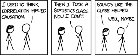
Figure 11.4: Correlation does not imply causation
When the correlation found \(r\) is not significant, then this can thus be by chance, and then we discount an interpretation of the correlation. We do then state in our report the correlation coefficient found and the established significance for it.↩︎
In some school books, this equation is described as \(Y = a X + b\), with \(a\) as the slope and \(b\) as the intercept; however, we keep to the conventional international notation here.↩︎
Only selected
Rfunctions from a so-called “whitelist” of functions are allowed.↩︎