8 Frequencies
8.1 Introduction
When analysing data, a distinction is often made between qualitative and quantitative methods. With the first method, observations (e.g. answers in interviews) are represented in words, and with the second method, observations (e.g. speech pauses in interviews) are represented in numbers. In our opinion, the difference between qualitative and quantitative methods lies in how observations are represented, and how arguments are made on the basis of these observations. Sometimes it is also possible to analyse the very same data (e.g. interviews) both qualitatively and quantitatively. The major advantages of quantitative methods are that the data can be summarised relatively straightforwardly (this is the subject of this part of the textbook), and that it is relatively simple to draw meaningful conclusions on the basis of the observations.
8.2 Frequencies
Quantitative data can be reported in various different ways. The most straightforward way would be to report the raw data, preferably sorted according to the observed variable’s value. The disadvantage of this is that a potential pattern in the observations will not be easily visible.
Example 8.1: Students \((N=50)\) in a first year course reported the following values for their shoe size, a variable of an interval level of measurement:
36, 36, 37, 37, 37, 37, 37, 37, 38, 38, 38, 38, 38, 38, 39, 39, 39, 39, 39, 39, 39, 39, 39, 39, 39, 39, 39, 39, 39, 39, 39, 39, 39, 40, 40, 40, 40, 40, 40, 41, 41, 41, 41, 41, 42, 42, 43, 43, 44, ??.
One of the students did not provide an answer; this missing answer is shown here as ??.
It is usually more insightful and efficient to summarise observations and report them in the form of a frequency for each value. This frequency indicates the number of observations which have a certain value, or which have a value in a certain interval or class. In order to get the frequencies, we thus count the number of observations with a certain value, or the number of observations in a certain interval. These frequencies are reported in a table. We call such a table a frequency distribution.
As a first example, Table 8.1 provides a frequency distribution of a discrete variable of nominal level of measurement, namely the phonological class of sounds in Dutch (Luyckx et al. 2007). #52-56
| main.class | sub.class | count |
|---|---|---|
| C | plos | 585999 |
| C | fric | 426097 |
| C | liq | 249275 |
| C | nas | 361742 |
| C | glide | 146344 |
| V | lang | 365887 |
| V | kort | 428832 |
| V | schwa | 341260 |
| V | diph | 61638 |
| V | rest | 1146 |
As a second example, Table 8.2 provides a frequency distribution of a continuous variable of interval level of measurement, namely the aforementioned shoe size of first year students (Example 8.1).
| Shoe size | 36 | 37 | 38 | 39 | 40 | 41 | 42 | 43 | 44 | ?? |
| Number | 2 | 6 | 6 | 19 | 6 | 5 | 2 | 2 | 1 | 1 |
Nevertheless, when a numerical variable is able to assume a great many different values, the frequency distribution thus consequently becomes large and confusing. We then add together values in a certain interval, and afterwards make a frequency distribution on the smaller number of intervals or classes.
Example 8.2: When Queen Beatrix of the Netherlands was giving her last Queen’s Speech, on 18th September 2012, she paused some \(305\times\). The frequency distribution of the pause length (measured in seconds) is shown in Table 8.3.
| Interval | Number |
|---|---|
| 4.50–4.99 | 1 |
| 4.00–4.49 | 0 |
| 3.50–3.99 | 2 |
| 3.00–3.49 | 7 |
| 2.50–2.99 | 4 |
| 2.00–2.49 | 25 |
| 1.50–1.99 | 32 |
| 1.00–1.49 | 16 |
| 0.50–0.99 | 67 |
| 0.00–0.49 | 151 |
8.2.1 Intervals
For a variable of nominal and ordinal level of measurement, we generally use the original categories to make the frequency distribution (see Table 8.1), although it is possible to add categories together. For a variable of interval or ratio level of measurement, a researcher can choose the number of intervals in the frequency distribution themself. Sometimes that is not necessary, for instance because the variable has a clear number of different discrete values (see Table 8.2). However, sometimes, as a researcher you have to decide for yourself how many intervals you should distinguish, and how to determine the interval boundaries (see Table 8.3). In this instance, the following are recommended (Ferguson and Takane 1989, Ch.2):
Ensure that all observations (i.e. the entire range) fall into roughly 10 to 20 intervals.
Ensure that all intervals are equally wide.
Make the lower limit of the first or second interval the same as the width of the intervals (see Table 8.3: every interval is 0.50 s wide, and the second interval’s lower limit is also 0.50).
Order the intervals in a frequency distribution from bottom to top in increasing order (i.e. from top to bottom in descending order), see Table 8.3).
The wider we make the intervals, the more information we lose about the precise distribution within each interval.
8.2.2 SPSS
Analyze > Descriptive Statistics > Frequencies...Select variable (drag to the “Variable(s)” panel).
Tick: Display frequency tables.
Choose Format, choose: Order by: Descending values.
Confirm with OK.
8.2.3 JASP
From the top bar, choose
DescriptivesSelect the variable(s) to summarize and place them into the field “Variables”. Check the option Frequency tables (nominal and ordinal variables) (below the field with Variables) to obtain frequency tables for all selected variables.
If a variable has higher measurement level (“Scale”, i.e. interval or ratio, Chapter 4), and you nevertheless want a frequency table of that variable, then you need to adjust the measurement level of that variable to “Nominal” or “Ordinal”. In JASP, you can do so by clicking on the icon for measurement level, preceding the variable name in the column header in the data window.
You may also want to divide or “cut up” the continuous variable into discrete intervals. This is achieved by first creating a new empty variable, and subsequently filling that variable with the discrete interval values. The resulting variable will be of ordinal measurement level.
To create a new variable, click on the + button to the right of the last column name in the data tab. A “Create Computed Column” panel appears, where you can enter a name for the new variable, e.g. troon12_ordinal. You can also choose between R and a pointer. These are the two options in JASP to define formulas with which the new (empty) variable is filled; using R code, or manually using JASP. The paragraphs below explain how to create an interval variable using these two options. Finally, you can check which measurement level the new variable should be (see Chapter 4), this should be Ordinal. Next, click on Create Column to create the new variable. The new variable (empty column) appears as the rightmost variable in the data set.
If the R option is chosen to define the new variable, a field with “#Enter your R code here :)” appears above the data. Here you can enter R code that generates random numbers using R functions. Enter the R code (see below) and click on Compute column at the bottom of the field to fill the empty variable with the numbers generated by the R code.
This snippet of R code cuts up the continuous variable troon2012 into the discrete intervals shown in Table 8.3:
cut( troon2012, breaks = seq(0, 5, 0.5) ) Parse this snippet from the innermost brackets outwards:
(i) seq: make a sequence from 0 to 5 (units, here: seconds) in increments of 0.5 seconds,
(ii) cut: cut up the variable (troon2012) in intervals based on this sequence.
If you do not know the width and range of the intervals, but instead you wish to obtain a particular number (say 10) of equal intervals, then use the following snippet:
cut( troon2012, 10 ) The first interval starts at the lowest score, and the last interval ends at the highest value of troon12, yielding 10 intervals in total.
If the pointer or manual option is chosen to define the new variable, a work sheet will appear above the data. To the left of the work sheet are the variables, above it are math symbols, and to the right of the work sheet are several functions. From those functions you can pick one to generate your random numbers. If something goes wrong, items on the work sheet can be erased by dragging them to the trash bin on the lower right bottom. After you have completed the specification on the work sheet, then click on the button Compute column under the work sheet, to fill the new variable with the ordinal values.
In order to cut up a continuous variable into equal and discrete intervals, pick the function cut(y) from the right. Drag the input continuous variable to the “values” field and enter the number of resulting intervals as “numBreaks” value. If you want to specify the width and number of intervals yourself, then use the R code option (see above).
Now, at last, you can make the frequency table of the ordinal variable created above, as described in the first paragraph of this subsection. Select the newly created ordinal variable(s) to summarize and place them into the field “Variables”. Check the option Frequency tables (nominal and ordinal variables) (below the field with Variables) to obtain frequency tables for all selected variables.
8.2.4 R
enq2011 <- read.table(
    file=url("http://www.hugoquene.nl/R/enq2011.txt"),
    header=TRUE )
table( enq2011$shoe, useNA="ifany" )
The output of the above table command is shown in Table 8.2.
The code NA (Not Available) is used in R to indicate missing data.
Parse this task from the innermost brackets outwards:
(i) seq: make a sequence from 0 to 5 (units, here: seconds) in increments of 0.5 seconds,
(ii) cut: cut up the dependent variable length in intervals based on this sequence,
(iii) table: make a frequency distribution of these intervals.
This task’s output is shown (in edited form) in Table 8.3.
8.3 Bar charts
A bar chart is the graphical representation of the frequency distribution of a discrete, categorical variable (of nominal or ordinal level of measurement). A bar chart is constructed of rectangles. All rectangles are equally wide, and the rectangle’s height corresponds with the frequency of that category. The surface area of each rectangle thus also corresponds with that category’s frequency. In contrast to a histogram, the rectangles are not joined up to each other along the horizontal axis, to show that we are dealing with discrete categories.
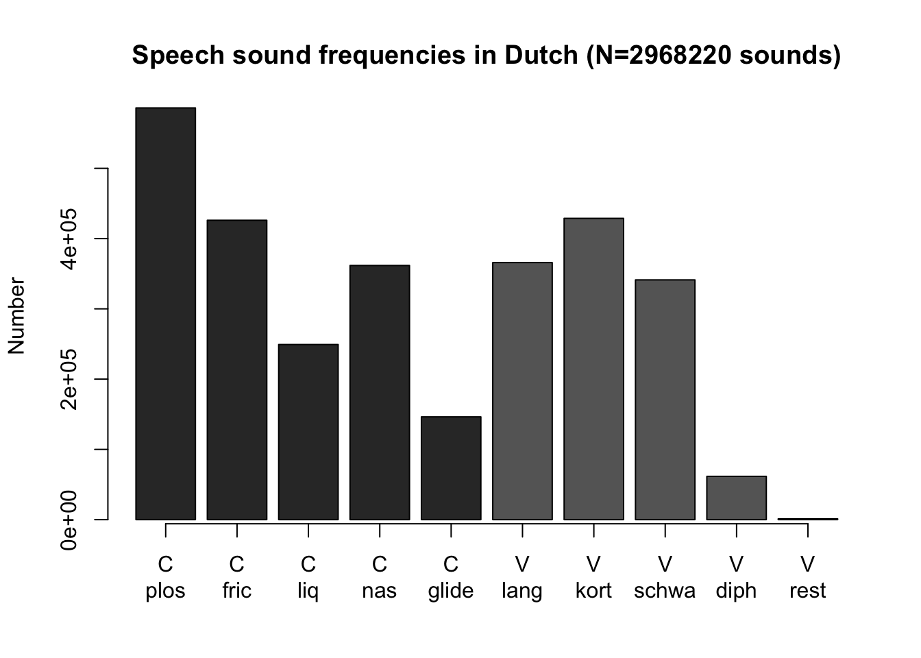
Figure 8.1: Bar chart of the frequency distribution of phonological class of speech sounds in the Corpus of Spoken Dutch (C=consonant, V=vowel).
A bar chart helps us to determine at a glance the most important distributional characteristics of a discrete variable: the most characteristic (most frequently occurring) value, and the distribution across categories. For the sound frequencies in Dutch (Figure 8.1), we see that amongst the consonants the plosives occur the most, that amongst the vowels the short vowels occur the most, that diphthongs are not used much (the sounds in Dutch ei, ui, au), and that more consonants are used compared with vowels.
Tip: Avoid shading and other 3D-effects in a bar chart! These make the width and height of a rectangle less readable, and the visible surface area of a shaded rectangle or of a bar no longer corresponds well with the frequency.
8.4 Histograms
A histogram is the graphical representation of a frequency distribution of a continuous, numerical variable (of interval or ratio level of measurement). A histogram is constructed of rectangles. The width of each rectangle corresponds with the interval width (a rectangle can also be one unit wide) and the height corresponds with the frequency of that interval or value. The surface area of each rectangle therefore corresponds with the frequency. In contrast to a bar chart, the rectangles do join up to each other along the horizontal axis.
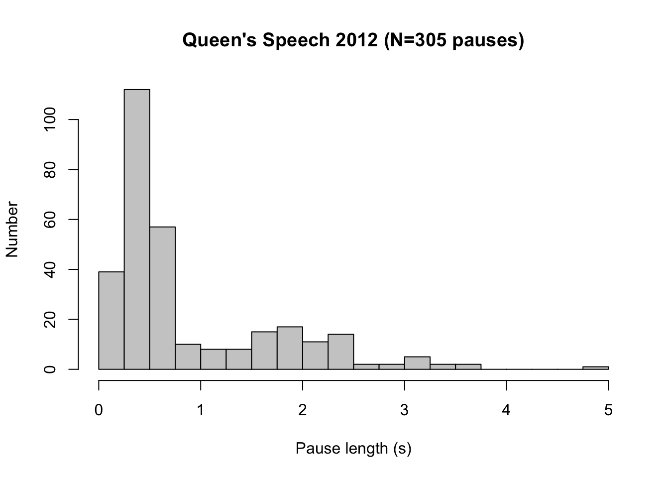
Figure 8.2: Histogram for the lengths of pauses (in seconds) in the Queen’s Speech of 18 September 2012, read by Queen Beatrix (N=305).
A histogram helps us to determine at a glance the most important distributional characteristics of a continuous variable: the most characteristic (most frequently occurring) value, the degree of dispersion, the number of peaks in the frequency distribution, the position of the peaks, and potential outliers. (see §9.4.2). For the pauses in the Queen’s Speech of 2012 (Figure 8.2), we see that the majority of pauses last between 0.25 and 0.75 s (these are presumably pauses for breath), that there are two peaks in the distribution (the second peak is at 2 s), and that there is one extremely long pause (with a duration of almost 5 s).
Tip: Avoid shading and other 3D-effects in a histogram! These make the width and height of a rectangle less readable, and the visible surface area of a shaded rectangle or of a bar no longer correspond well with the frequency.
8.4.1 SPSS
Analyze > Descriptive Statistics > Frequencies...Select variable (drag to the “Variable(s)” panel).
Choose Charts, then pick Chart type: Bar chart for a
bar chart or Chart type: Histogram for a histogram (see
the above text for the difference between these options).
Confirm with OK.
8.4.2 JASP
From the top bar, choose
DescriptivesSelect the variable(s) to summarize and place them into the field “Variables”. Open the “Plots” field and check the option Distribution plots (under the header “Basic plots”).
JASP will automatically make a bar chart if the variable is discrete (nominal or ordinal), and it will make a histogram if the variable is a scalar, i.e., numerical and continuous (interval or ratio). Ensure that the correct measurement level is specified for your variables. In JASP, you can set the measurement level by clicking on the icon for measurement level, which precedes the variable name in the column header in the data window.
8.4.3 R
You can make a bar chart like Figure 8.1 in R with the following commands:
# read data
klankfreq <- read.table( file="data/klankfreq.txt", header=T )
# 20201130 column names in English
dimnames(klankfreq)[[2]] <- c("main.class","sub.class","count")
# make barplot from column `count` in dataset `klankfreq`
with( klankfreq, barplot( count, beside=T,
                          ylab="Frequency",
                          main="Frequencies of speech sounds in Dutch (N=2968220)",
                          col=ifelse(klankfreq[,1]=="V","grey40","grey20") ) ) -> klankfreq_barplot
# make labels along the bottommost horizontal axis
axis(side=1, at=klankfreq_barplot, labels=klankfreq$main.class)
axis(side=1, at=klankfreq_barplot, tick=F, line=1, labels=klankfreq$sub.class )
# or simpler: with(klankfreq, barplot(count) ) # all defaults
You can make a histogram like in Figure 8.2 in R with the follow commands:
# read dataset
load(file="data/pauses6.Rda")
# extract pause lengths (columns 12) for the year 2012, into a separate dataset `troon2012`
troon2012 <- pauses6[ pauses6$jaar==2012, 12 ] # save col_12 as single vector
# make histogram
hist( troon2012,
      breaks=seq(0, 5, by=0.25),
      col="grey80",
      xlab="Length of pause (s)", ylab="Frequency",
      main="Queen's Speech 2012 (N=305 pauses)" ) -> troonrede2012pauzes_hist